Team
Riya Daiya (Me)
Tools
Figma
Wix Studio
My Role
UI/UX Designer
Visual Designer
Client
Indigenous Tutoring and Mentoring Program (ITMP)

A complete re-design of ITMP's website to pitch ITMP's value proposition, improve site usability, accessibility, and enhance overall user experience.
Context
ITMP is an online tutoring non-profit that provides free tutoring to indigenous students (K-12) in Canada. Parents enrol their children in the program through an application form on their website.
The Problem
Users found the website difficult to navigate due to inconsistencies in design and information structure, which hindered user trust and program enrolment.
My impact
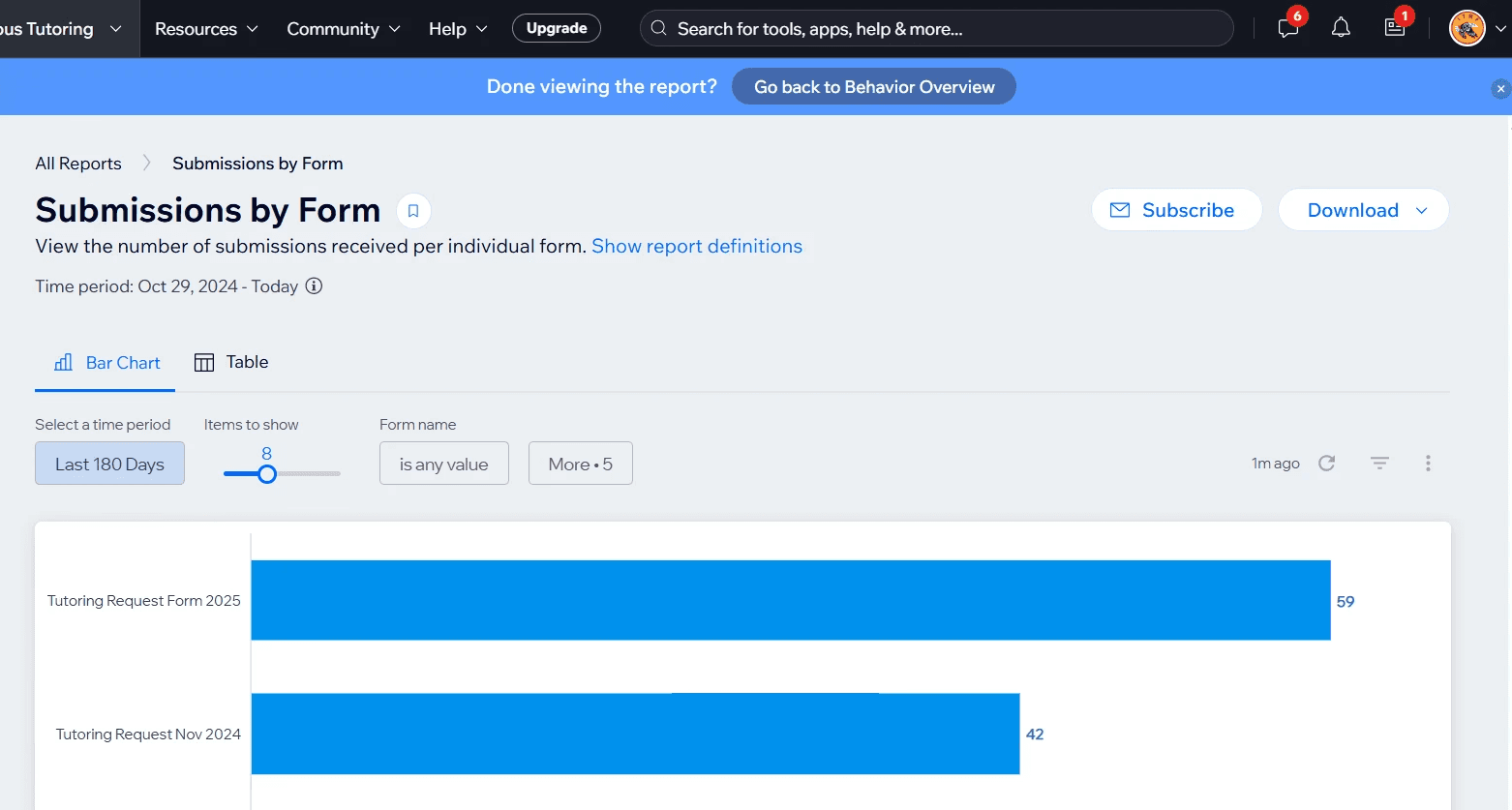
I created Design System used by 50+ users and 2 developers. Increased user sign-ups by 40.4 % from October 2024-April 2025. We also noticed a 60% increase in website visits.
Northwest Indigenous style of UI design presented to Indigenous co-founders recieved positive feedback and approval.
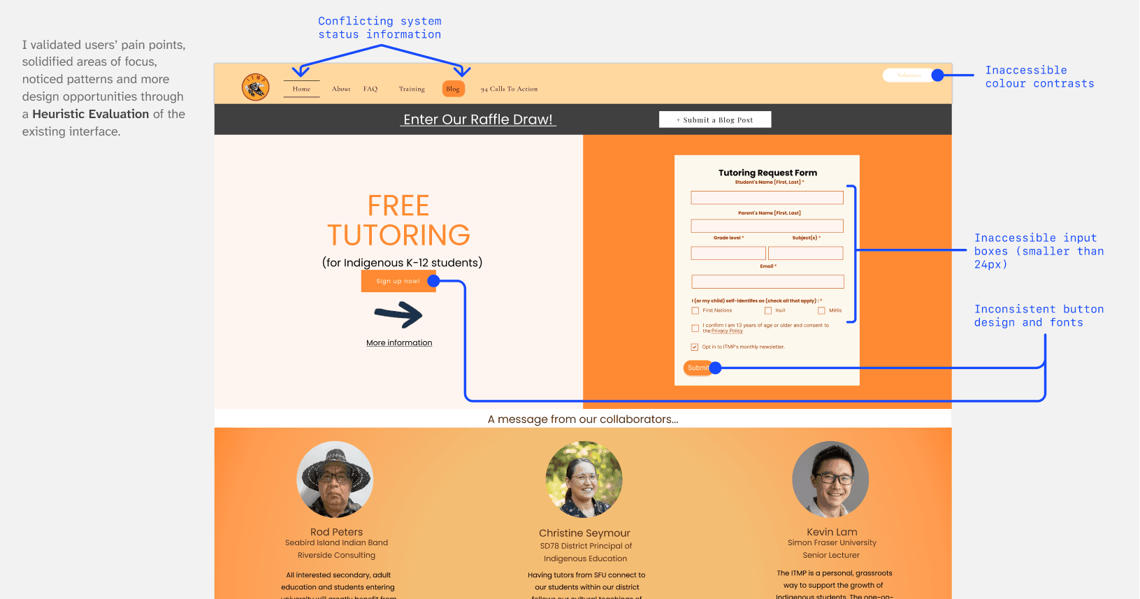
PROBLEM DISCOVERY
User feedback showed need for redesigns
Users reported pain points directly to the ITMP team. They had difficulty filling out the program application and navigating the website for resources. Many also reported mistaking ITMP for a homeschooling tutor service. I found these specifics when I asked follow up and clarification questions to stakeholders.
Difficult web navigation due to inconsistent visuals and layout.
Parents are busy and need quick access to the application form.
ITMP's type of service and purpose were unclear to users.
KEY INSIGHTS
EMPATHISING
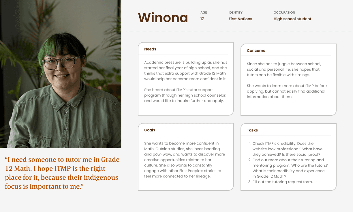
Meet Winona, my persona
I created a persona to clarify who I was designing for, and to empathise with her concretely and realistically. This was helpful in a major re-design project like this, where I could define the most important and realistic need and work my way up from there 🫡
PROBLEM FRAMING
How might we communicate ITMP’s service offering and value clearly on their website, and make the tutor request application form accessible so that users can make well-informed decisions and build trust with ITMP ?
PLANNING
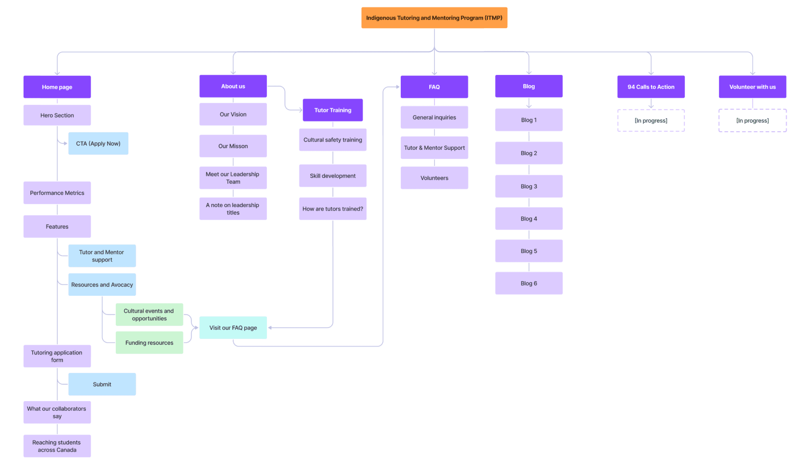
Turns out that info about ITMP’s services was solely hidden in the About page. This meant that I had to move around and delegate the content to different pages, so that I could craft a concise yet solid pitch on the home page.
I created an Information Architecture and did content auditing of every section of every page to make sure all content is logically discoverable, and properly structured into hierarchies.
SOLUTION
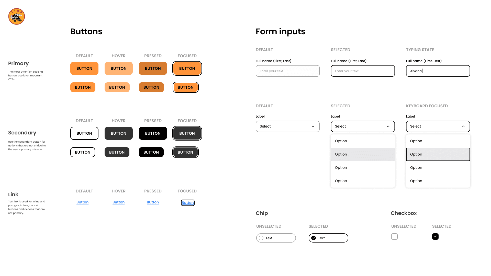
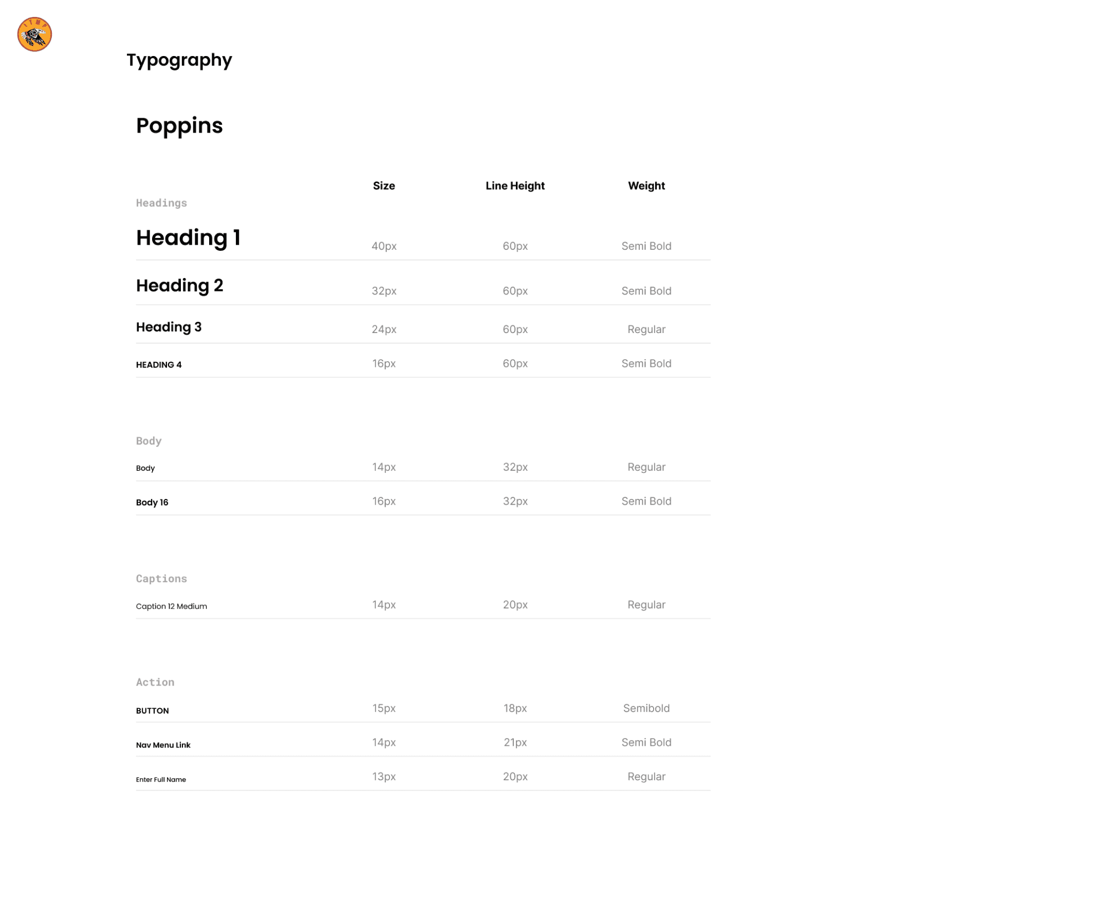
Crafting a robust Design System from scratch
I created a design system compliant with WCAG AA Accessibility standards, that goes beyond what is used in the final design. This not only helped me design my pages but also helped developers develop components on Wix and re-use them.


SOLUTION
A high-converting landing page and why it works: get ready to scroll!
I could have made a demo video, but I wanted to give you a front-row seat 🍿
Value proposition, followed by a clear Call To Action.
Social proof and statistical impact shown through culturally representative custom icons.
Selling the experience: showing users what their life would look like while using the service.
Another call to action: An accessible form with buttons and chips that don’t demand precision: They are large and spacious enough to be clickable.
Take me to the video demo👇
More social proof, adding credibility through testimonials from people with photos, names and their roles.


SOLUTION
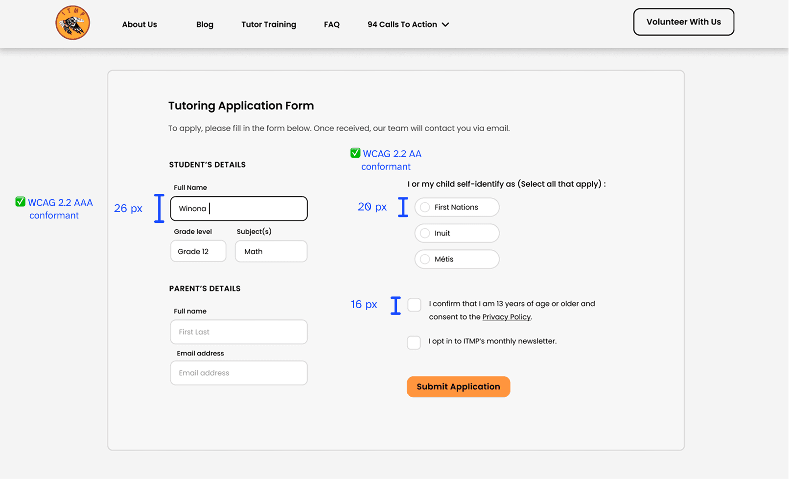
An accessible and confident form filling experience
When users are on a specific task (writing their name or selecting an option), sharp colour contrast on the input label allows users to focus, and enter answers confidently.
SOLUTION
A clear and concise About page, with social proof, mission and value statements.
BEHIND THE SCENES
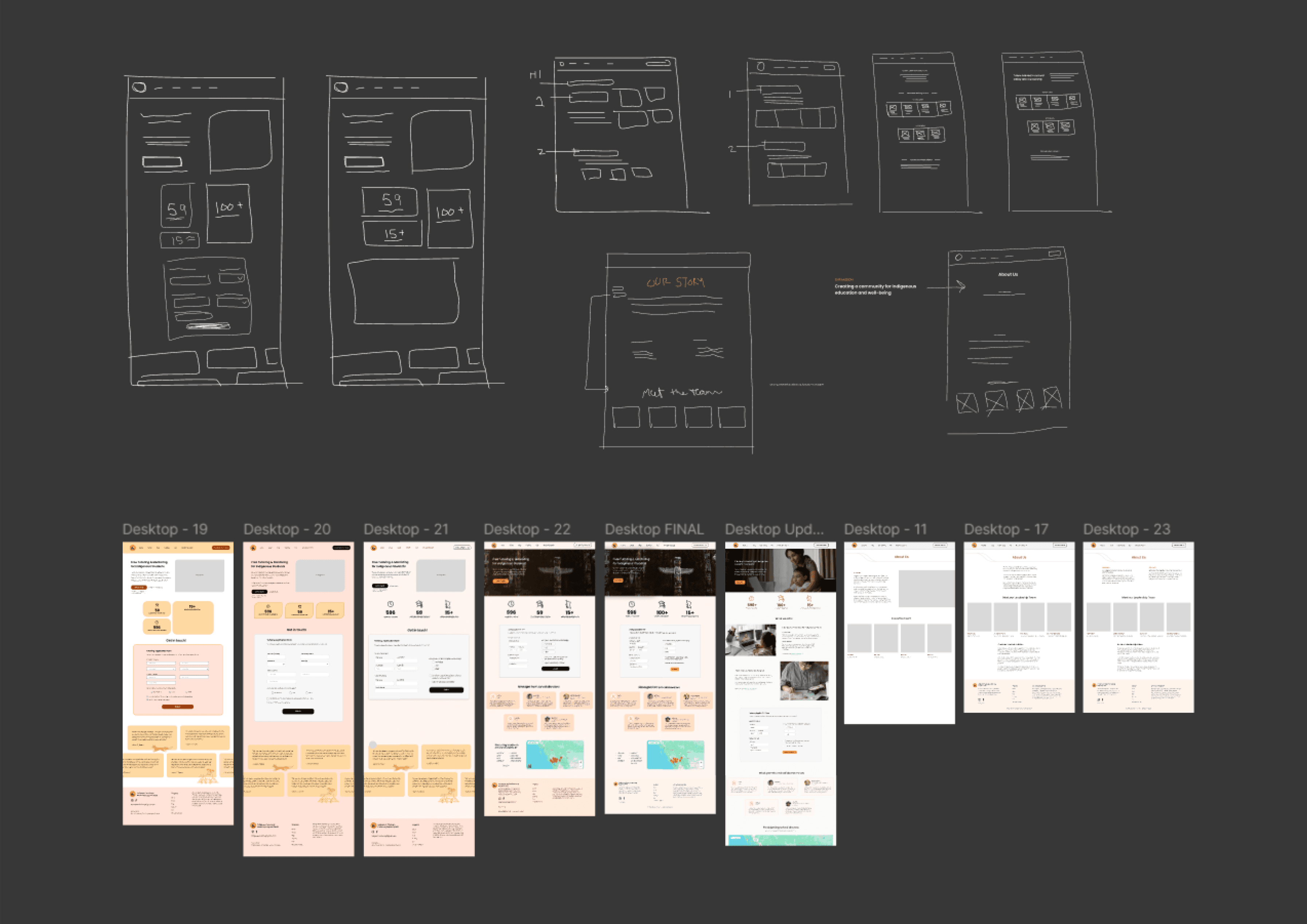
Sketches, low and medium-fidelity wireframes
While re-desgining, I made sure to not break familiar user flows. Hence why I kept some of the core functionalities and components that do not disrupt user needs the same place.
I presented my decisions to of 5-10 non-design teams, where I explained my design decisions and outcome, in simple, general terms. This opened up a clear communication channel for feedback and critique.
Always be prepared to explain to a non-design audience.
I presented my design decisions and intentions Indigenous executives and co-founders of ITMP, which was met with positive feedback and approval.
This taught me the importance of listening and understanding other viewpoints before proposing your ideas or solutions.
Listen, understand, empathise and then act.
I am not of Indigenous origin and was initially worried about stepping into someone else’s shoes. However, the program leads of ITMP assured me that they believed that all communities on unceded lands have a shared and equal responsibility to uplift and empower.
Reconciliation is not a one community job.
Learnings and Reflection